
The Style of Fonts: A Guide to Choosing Type That Tells Your Brand Story

Fonts are more than design elements. They are visual voices. Quietly powerful, instantly expressive, and deeply tied to emotion. The style of fonts you choose can say elegance, boldness, warmth, or clarity, even before a single word is read.
As a brand and web designer who’s worked with heart-led entrepreneurs, I’ve seen how type can elevate a brand’s message when chosen with intention. In this guide, we’ll explore different styles of fonts, their personality traits, and how to align them with your brand’s identity and story.
Why The Style of Fonts Matters In Branding
In branding, everything from color, space, imagery, to tone, speaks. But typography is often the first impression. A serif font might evoke trust and tradition, while a minimalist sans serif says modern and refined. Fonts help shape perception, guide attention, and invite connection.
Choosing the right font style is about more than aesthetics. It’s about clarity and emotion. The style of fonts you choose must align with your brand values, your audience, and how you want to be remembered.
5 Main Styles of Fonts and What They Convey
There are five foundational styles of fonts you’ll come across in branding and design. Each carries its own tone, history, and design application.
1. Serif Fonts
Classic, Trustworthy, Elegant.
Serif fonts have small lines (serifs) at the ends of strokes. Think: Times New Roman, Georgia, or Garamond.
Why use them:
Suggest professionalism and heritage
Work well for editorial brands, law firms, fine art or luxury products
Evoke tradition, depth, and legacy
Example use:
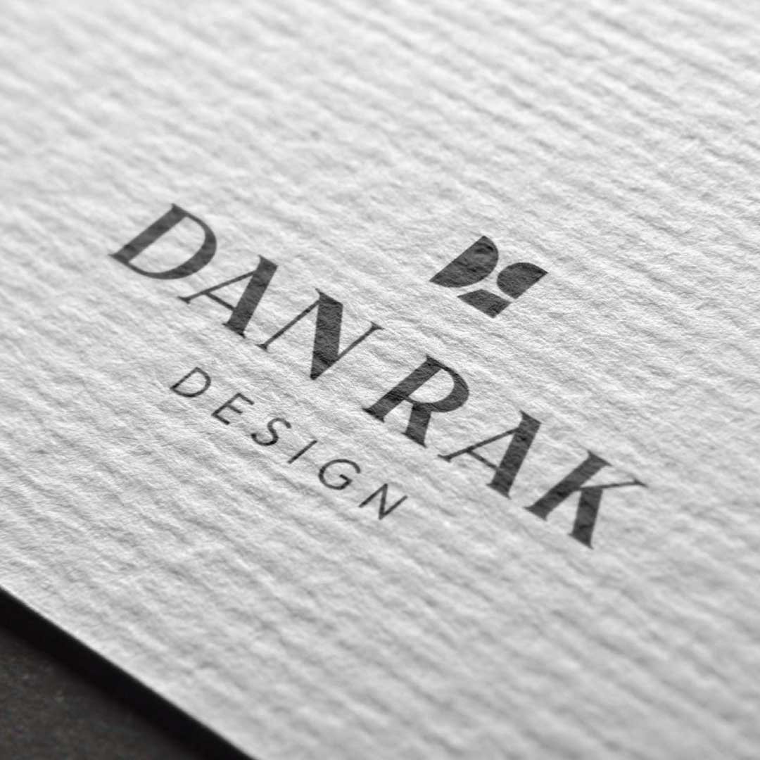
A boutique interior design studio with an editorial feel might choose a refined serif to convey sophistication.
2. Sans Serif Fonts

Clean, Modern, Approachable.
Sans serifs lack the “feet” of serif fonts, offering a cleaner, more modern aesthetic. Think: Helvetica, Futura, or Montserrat.
Why use them:
Feel accessible and user-friendly
Great for tech, wellness, or minimalist brands
Pair beautifully with strong visuals
Example use:
A modern skincare brand might opt for a soft rounded sans serif to reflect clarity and purity.
3. Script Fonts

Elegant, Artistic, Romantic.
Script fonts mimic handwriting or calligraphy, bringing fluidity and grace. Think: Great Vibes, Allura, or custom calligraphy.
Why use them:
Feel personal and emotive
Ideal for invitations, feminine brands, or artistic ventures
Best used sparingly (like in logos or headlines)
Example use:
A wedding planner might use a custom script font for a signature-style logo that feels heartfelt and bespoke.
4. Display Fonts

Bold, Unique, Eye-Catching.
Display fonts are decorative and often used to stand out. They’re less about readability and more about personality. Think: chunky serif display fonts, retro styles, or highly stylized letterforms.
Why use them:
Make a statement and create visual drama
Works well for branding with strong creative direction
Ideal for headings, posters, or brand marks
Example use:
A vintage-inspired café might use a hand-drawn display font for signage and merch to build charm and character.
5. Monospace Fonts

Technical, Structured, Minimal.
Each letter in a monospace font takes up the same width. These fonts feel mechanical, retro, and are often used in code or design systems. Think: Courier, Consolas, or IBM Plex Mono.
Why use them:
Create a utilitarian, precise vibe
Suitable for portfolios, tech brands, or minimalist aesthetics
Offer contrast when paired with serif or sans-serif fonts
Example use:
A web developer or creative coder might use a monospace font for their site to reflect clarity and structure.
How to Choose the Right Font Style for Your Brand
So, how do you choose a font that fits?
Here are five guiding questions:
What does your brand want to feel like?
Calm? Bold? Whimsical? Grounded?Who is your audience?
Fonts should speak the language of your ideal customer.Where will this font show up?
Consider usability across your website, packaging, and printed materials.How will it pair with other brand elements?
Fonts must harmonize with your color palette, imagery, and layout style.Is legibility a priority?
Some font styles look beautiful but don’t scale well. Function matters.
Pairing Fonts: A Few Quick Tips
Pairing fonts can bring balance and contrast. A common approach is to combine a serif with a sans serif. For example, a classic serif for headlines and a simple sans serif for body text. Or use a script font for a logo wordmark with a geometric sans serif for web use.
Tips for successful pairings:
Stick to 2 font styles max for cohesion
Contrast weights (bold vs light) and forms (round vs sharp)
Consider x-height and spacing for readability
Test your fonts across platforms
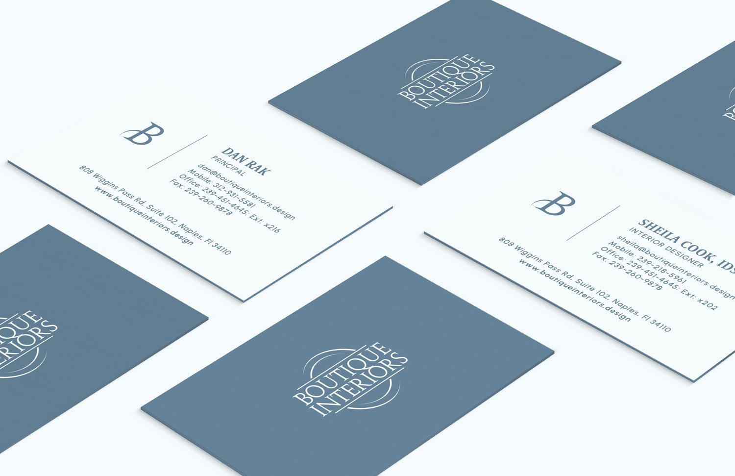
Fonts in Action: A Real Example
Recently, I worked on a brand identity for Boutique Interiors, an interior design studio rooted in thoughtful elegance. We paired a soft serif with generous spacing to reflect their calm and refined aesthetic, and balanced it with a clean sans serif for digital clarity.
The result? A visual voice that felt elevated, welcoming, and true to their story.
That’s the power of font style. It doesn't just decorate, it communicates.
Final Thoughts: Let Your Typography Speak for You
Whether you're rebranding, creating a website, or refining your visual identity, choosing the right style of fonts is one of the most impactful decisions you can make. Done well, typography becomes a silent ambassador of your brand, quietly creating a connection and leaving a lasting impression.
So ask yourself:
What story does your font style tell?
And if you’re unsure where to start, I’d love to help.
I specialize in crafting elevated brand identities and websites for small businesses. Click here to learn more about my services.
RELATED POSTS:


